Mobile Solutions
If your website was built before mobile phones and tablet computers became omnipresent additions to our daily lives, it may not be a ‘responsive’ design. As so many people search the worldwide web from their handheld mobile devices, modern websites need to be able to adjust to all major screen sizes and browsers. Gone are the days of having to zoom in on your phone to view a website’s content!
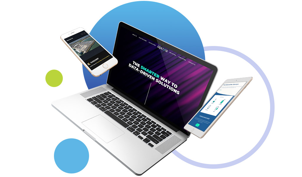
How cool does your website’s design look on mobile? Is it easy to navigate?

Mobile Optimisation: Tweak the Design
Tiny adjustments make sure your website’s mobile version looks just as good as the desktop version, or even better!
Minimise Bounce Rates: Keep Users On-Site
The key to making sales or receiving enquiries on a mobile landing page is ensuring visitors don’t have any reason to leave. Ease of use is a necessity.
Features and Functionality: Hit, don’t miss.
Know what it feels like to fail at filling out a form or make an important payment when only mobile devices were at hand and time was of the essence? You clients deserve better.

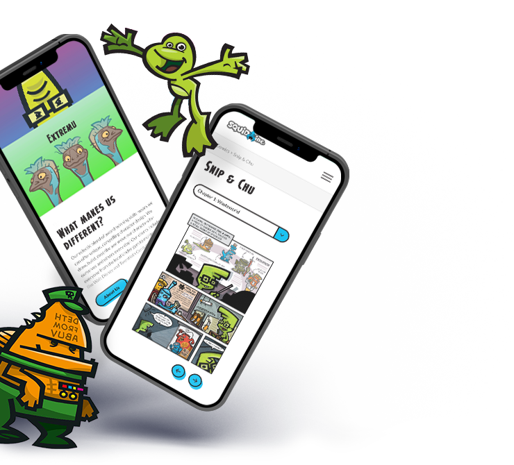
Squid Inc
Character design and animation studio, Squid Inc., uses its website to showcase its team’s amazing artwork, and so we wanted to make sure their creative expressions presented well no matter which device someone was viewing them on. A full custom WordPress design and build, we optimised the website so Squid Inc.’s illustrations and animations would still ‘pop’, even when viewed on a rather small mobile screen size.
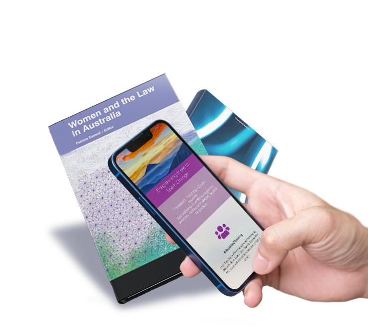
Legal Light Bulbs
Legal Light Bulbs is devoted to illuminating social injustices and opportunities to spark change, and it was our goal to make the legal consultancy’s website mobile-friendly so their altruistic service could also be illuminated – on the World Wide Web. A simple mobile ‘hamburger menu’ and pages divided into user-friendly content blocks provide website visitors with easy access and navigation to the specific legal topics they’re searching for. Fonts and font-sizes are also optimised to ensure a seamless user experience.